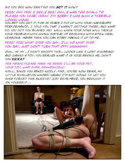
Hey everybody! Been a little behind on posts, but does it help that I've been capping again? No? Then here's another cap for you all to enjoy!
I don't remember much about this one.. it was a during a time when I was making so many caps I was working on my next as soon as I was done with my last one. (sometimes two at a time!) But I know I wanted play around with a forced angle and willing. Came out pretty nice I think. ^_^
Edit: I added a alt layout based on some suggestions.


Nice cap Jennifer. I think you got that forced changing to willing angle pretty good! The story works really well with that pic. The look on Erika's face is priceless!
ReplyDeleteohh, nice cap, and yes you pulled off the willing and forced thing wonderfully. additionally "you are now my humiliation whore" is probably one of my favorite lines in a caption now.
ReplyDeleteAs someone that owns the white version of that little pleasure toy .. I don't think anyone (male of female) could withstand too much pleasure without giving in. Just depends on where you place that dee-lightfully dee-monic dee-vice.
ReplyDeleteGreat story line, though I think it'd have been more impactful if you split the text up with the picture, right after Erik says the second piece of dialog. Seems like too much white space. I think that Caitlyn probably does a better job of keeping the caption busy without overdoing it out of anyone I've ever seen. Now, I just have to keep my envy down to a minimum LOL
Very nice cap. Thanks.
ReplyDelete@ Caitlyn, venatus, femslut21
ReplyDeleteThank you both. I'm glad you enjoyed the story. ^_^
@ Dee
Thank you for the suggestion. Though I think it would look very ugly and possibly interrupt the flow of the story. Which is what I think you were trying to avoid right?
After Discussing some layout's with Caitlyn, we came up with this design that I think offer's a good alternate look for the caption. (for those that had a problem with the first one.)
And you are right about Caitlyn doing a very good job of keeping a caption busy. But while I may have missed the mark on what I was going for, Keeping the cap busy while I was going for a minimalist approach is kind of the opposite of what I was trying to achieve. Like Caitlyn Suggested, the white space that you did not like would have actually been blown up about 3 times it's size to fit the minimalist look. (though It was one of my very first caps I've tried attempting this with.)
I like branching out and trying new layouts. Some people get comfortable with doing the same look for every cap they make And that's not a problem, especially when that look is aesthetically pleasing. But I enjoy sticking my neck out there and trying something new and I respect those that like to expand their horizons.
Sorry I haven't been around to discuss this earlier.
ReplyDeleteI had suggested it because (1) there seemed to be a huge amount of white at the top of the caption, and also the sides of the picture (2) the story (to me) seemed to be of 2 parts, before and after he gave up everything to submit to his wife, with the picture giving you that moment. I thought it would be a good spot to let the picture delineate where his life changed forever.
The second one does look better in edit, but when I look at it, I wonder if it is the color WHITE background that is making me think the way I do. If it was black instead, with white and pink text, would it seem as empty as the original did?
I hope people aren't thinking that I'm casting aspersions on your caption. I keep coming back because you are my friend AND I get to see your captions told with a bit more background that what we get on the Haven.
Just realized something else as well. When I click on the picture, it comes up on the left side of the browser, AND there is a ton of white from where the caption ends into the entire browser. I'm sure that THAT has something also to do with how much white I am seeing, since the white in your caption just bleeds into the rest of the page.
ReplyDelete